Exhibition | Helen Frankenthaler Prints: Seven Types of Ambiguity
How a picture works best for me involves how much working false space it has in depth. . . . whether it be a Cubist Picasso or Braque or a Noland stripe painting—it’s a play of ambiguities.
—Helen Frankenthaler
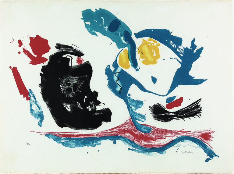
, Essence Mulberry, 1977. Color woodcut. © 2019 Helen Frankenthaler Foundation, Inc. / Artists Rights Society (ARS), New York / Tyler Graphics, Ltd., Bedford Village, New York") One of the most influential American artists to emerge during the mid-twentieth century, Helen Frankenthaler (1928–2011) is best known for her innovative abstract paintings in which she poured washes of color over great expanses of raw canvas. Beginning in 1961, printmaking also became an integral part of her practice, and she went on to become the most prolific printmaker of her generation. Frankenthaler’s print work is remarkable for the diversity of techniques she employed, the number of studios with which she collaborated, and the ways in which her engagement with printmaking was simultaneously independent from and in sync with her practice as a painter. Throughout her printmaking career she continued to demonstrate her facility for foregrounding the natural properties of the media—stone, metal, wood, paper, and ink—just as she had done so radically with paint and canvas.
One of the most influential American artists to emerge during the mid-twentieth century, Helen Frankenthaler (1928–2011) is best known for her innovative abstract paintings in which she poured washes of color over great expanses of raw canvas. Beginning in 1961, printmaking also became an integral part of her practice, and she went on to become the most prolific printmaker of her generation. Frankenthaler’s print work is remarkable for the diversity of techniques she employed, the number of studios with which she collaborated, and the ways in which her engagement with printmaking was simultaneously independent from and in sync with her practice as a painter. Throughout her printmaking career she continued to demonstrate her facility for foregrounding the natural properties of the media—stone, metal, wood, paper, and ink—just as she had done so radically with paint and canvas.
Frankenthaler began making prints at the urging of her friends the poet Frank O’Hara and fellow painter Grace Hartigan, two of the first creative figures to collaborate with Universal Limited Art Editions (ULAE) in New York on prints and limited-edition artists’ books. Frankenthaler’s artistic career had taken off in the 1950s, a period in which the seeds of an American printmaking renaissance were also planted. The florescence of fine art printmaking at midcentury resulted from the tightly intertwined bonds between master print technicians and the postwar artists, writers, and critics of the densely interconnected New York art world.
This exhibition takes its subtitle from Seven Types of Ambiguity (1930), an iconic essay by the literary critic William Empson (1906–1984), which articulated the ways that formal structures of language could convey a multiplicity of meanings in poetry. For the postwar American avantgarde, Empson’s essay was not only the foundational work for the literary theory movement known as New Criticism but also highly influential for abstract artists. In 1957 Frankenthaler borrowed the essay’s title for her large painting Seven Types of Ambiguity, which will be on view at the start of the exhibition, making clear the artist’s own affinity for Empson’s work. Variously focusing on Frankenthaler’s compositional language, working process, historical referents, and collaborations with particular printmaking studios, the seven loosely chronological sections of the exhibition embrace the central principle of Empson’s text: that close reading, like close looking, can yield deep relationships with an abstract composition.
I: LINE + FIELD
Beginning with her earliest prints, lithographs made at ULAE in 1961, Frankenthaler adapted the approach she used with paint and canvas to the materials of ink, paper, and stone to combine gestural lines and fields of color. These visual principles remained steady even as she further developed techniques in lithography, screenprint, pochoir, etching, and aquatint in collaboration with various print studios. This first section includes prints from three decades to explore the central facet of Frankenthaler’s printmaking: dynamic compositions that delicately balance layers of linear marks and planes of color.
II: EVOLVING VISION
This section is a study of Frankenthaler’s painstaking working process through three prints, a lithograph and two woodcut editions, that she made with Kenneth Tyler and Tyler Graphics in 1977. By showing a succession of related proofs for each print—multiple impressions printed in different colors on various papers, some with hand-drawn modifications—we can trace the evolution of the final compositions, illustrating Empson’s fifth type of ambiguity, “when the author is discovering his idea in the act of writing.”
III: BLACK IS A COLOR
In her prints Frankenthaler treated black ink as an expressive field or a compositional layer in ways reserved primarily for color in her paintings. Her use of black ink reveals her historical engagement with various technical considerations in printmaking—the fluidity of lithographic tusche washes and the textured grain and velvety black of aquatint—as well as her method for setting off different processes as their own material layers within a composition.
As the print evolves, it tells you, you tell it.
You have a conversation with a print
– Helen Frankenthaler, 1988
IV: LOS ANGELES TOPOGRAPHY
Frankenthaler studied with the Mexican artist Rufino Tamayo (1899–1991) at Dalton high school and following graduation; much later, in 1989, she made a series of prints at the Mixografia workshop in Los Angeles. The images were printed from a hand-inked cast-copper plate using a technique developed by Tamayo and Mixografia in the 1970s in which the print is simultaneously embossed and debossed in order to integrate three-dimensional relief into the final composition.
V: BAY AREA MONOTYPES
Frankenthaler collaborated with Garner Tullis to create two bodies of expressive, experimental, and visually diverse monotypes directly printed in single impressions from hand-painted metal plates. She worked first in Tullis’s San Francisco workshop in the early 1980s and then nearly a decade later in his New York studio, where she expanded her technique to include printing from sheets of plywood. This partnership marks one of the most prolific moments in Frankenthaler’s printmaking career and helped to unify her practice as both a painter and a printmaker.
VI: TALES OF GENJI
In 1995 Frankenthaler and Tyler’s shared interest in Japanese prints led them to collaborate on what would become their last two woodcut projects together—a series of large-scale prints inspired by one of the most frequently illustrated literary epics in Japanese art, The Tale of Genji, and the monumental three-panel woodcut Madame Butterfly.
These seven color woodblock prints were carved and printed in water-soluble inks on damp paper by the master craftsman Yasuyuki Shibata in traditional Japanese ukiyo-e manner at Tyler Graphics. Together they constitute the most distinctive, strikingly complex prints of her career.
Helen Frankenthaler, First Stone, 1961. Color lithograph. © 2019 Helen Frankenthaler Foundation, Inc. / Artists Rights Society (ARS), New York / Universal Limited Art Editions, West Islip, New York
VII: RETURNING
In Weeping Crabapple (2009), Frankenthaler’s final print, she resuscitated a work on paper made at Tyler’s artist’s studio in 1995. The process of making prints in a workshop was iterative and involved periods of waiting between proofs. Frankenthaler often filled this time drawing, sometimes on proofs of earlier stages. When she returned to this drawing in 2009, Tyler had closed his New York workshop, and Shibata had gone on to Pace Prints, where Frankenthaler would work with him on her final woodcuts. In realizing this print, she continued to foreground the process—collaborative, multistep, and multi-technique—that she would remark distinguished the practice of printmaking from painting.
From her inaugural print, a lithograph titled First Stone (1961), Frankenthaler showed an extraordinary ability to liberate a printmaking technique from its traditional appearance and make it conform instead to her own distinctive visual language. Her print work became increasingly complex over the course of her career as she integrated the textures and densities of multiple types of wood into the matrix for her woodcut prints or manipulated the paper’s surface, color, and margins as part of each composition. And yet, these processes almost disappear in the final editioned prints; Frankenthaler was not interested in impressing viewers with technical feats but rather in using these innovations to achieve particular visual effects. In creating prints that transcended conventional understandings of each medium, she had forever changed what was considered possible in printmaking.
Mitra Abbaspour
Haskell Curator of Modern and Contemporary Art
Calvin Brown
Associate Curator of Prints and Drawings
Helen Frankenthaler Prints: Seven Types of Ambiguity is made possible through the generosity of the Helen Frankenthaler Foundation. This exhibition is further supported by the Kathleen C. Sherrerd Program Fund in American Art; Susan and John Diekman, Class of 1965; Heather Sturt Haaga and Paul G. Haaga Jr., Class of 1970; Roberta and Jonathan Golden, Class of 1959; the Robert Wood Johnson III Fund of the Princeton Area Community Foundation; the Julis Rabinowitz Family; Christopher E. Olofson, Class of 1992; the New Jersey State Council on the Arts, a partner agency of the National Endowment for the Arts; and the Partners and Friends of the Princeton University Art Museum.